
THE BEAUTY OF SCIENTIFIC DIAGRAMS
NOVEMBER
2013
This exploratory project was done during my undergraduate studies at the National Institute of Design. Classroom projects are around 8 weeks long, where students are encouraged to frame their own brief based on a personal interest. This meant I was responsible for the concept, Research, Art Direction, Illustrations, and documentation of the project.
The beauty of Scientific diagrams is a lettering series that aims to integrate the initial of a scientist with the diagram of their invention or discovery. The project is part glossary, part personal project that was a result of my two passions at the time: design and non-fiction science books. The most challenging part of the project was figuring out how to distort the diagrams to fit the respective letter such that it wasn’t rendered useless, so that if a physical model was made in front of you, it would work as efficiently as the original diagram.
FIELD Illustration + Poster design
CLIENT Personal Project
PRESS
WIRED
Fast Company
Complex
Wepresent
Typeroom
etapes
Gizmodo
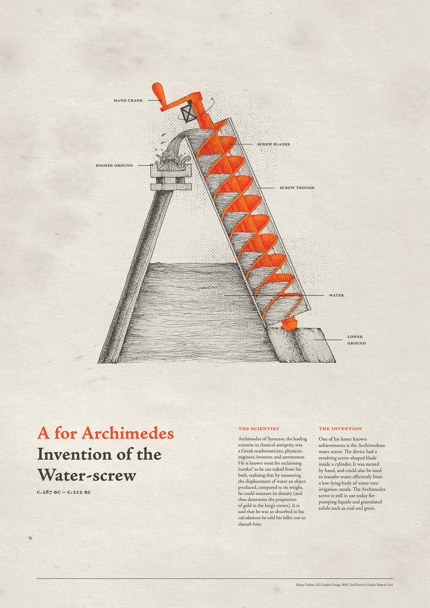
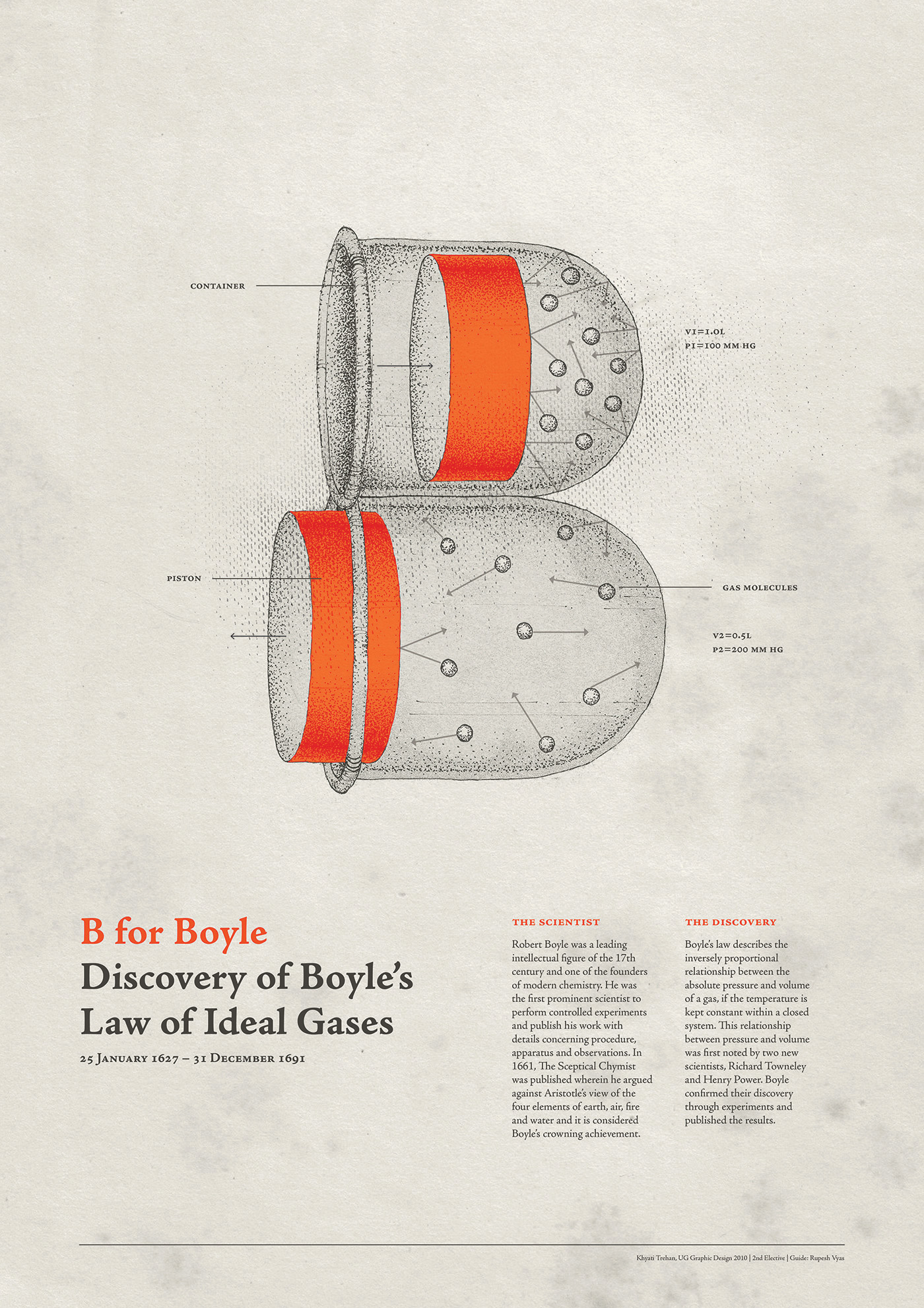


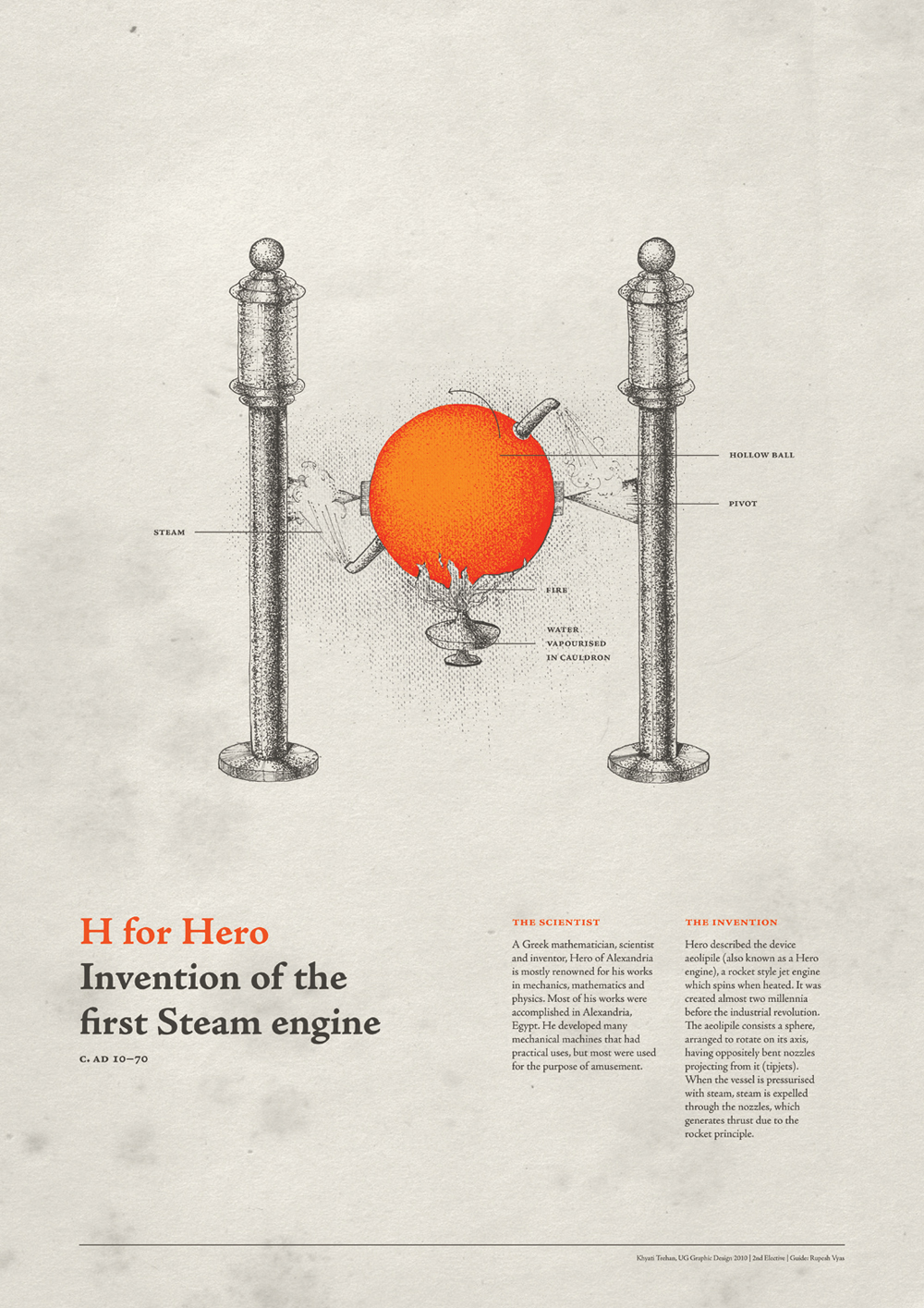
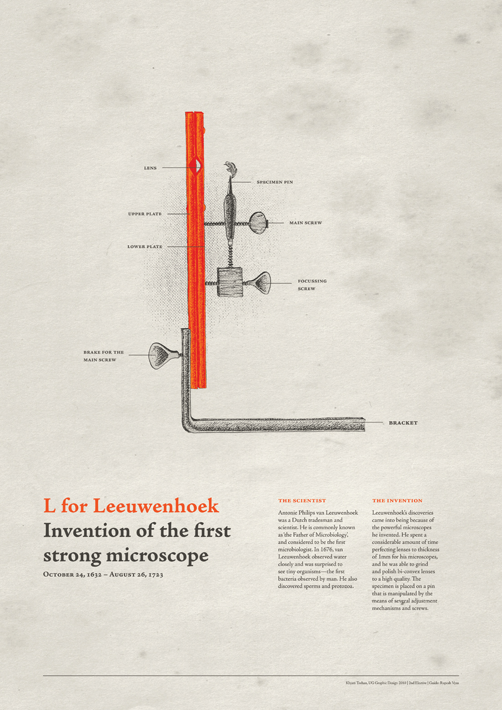

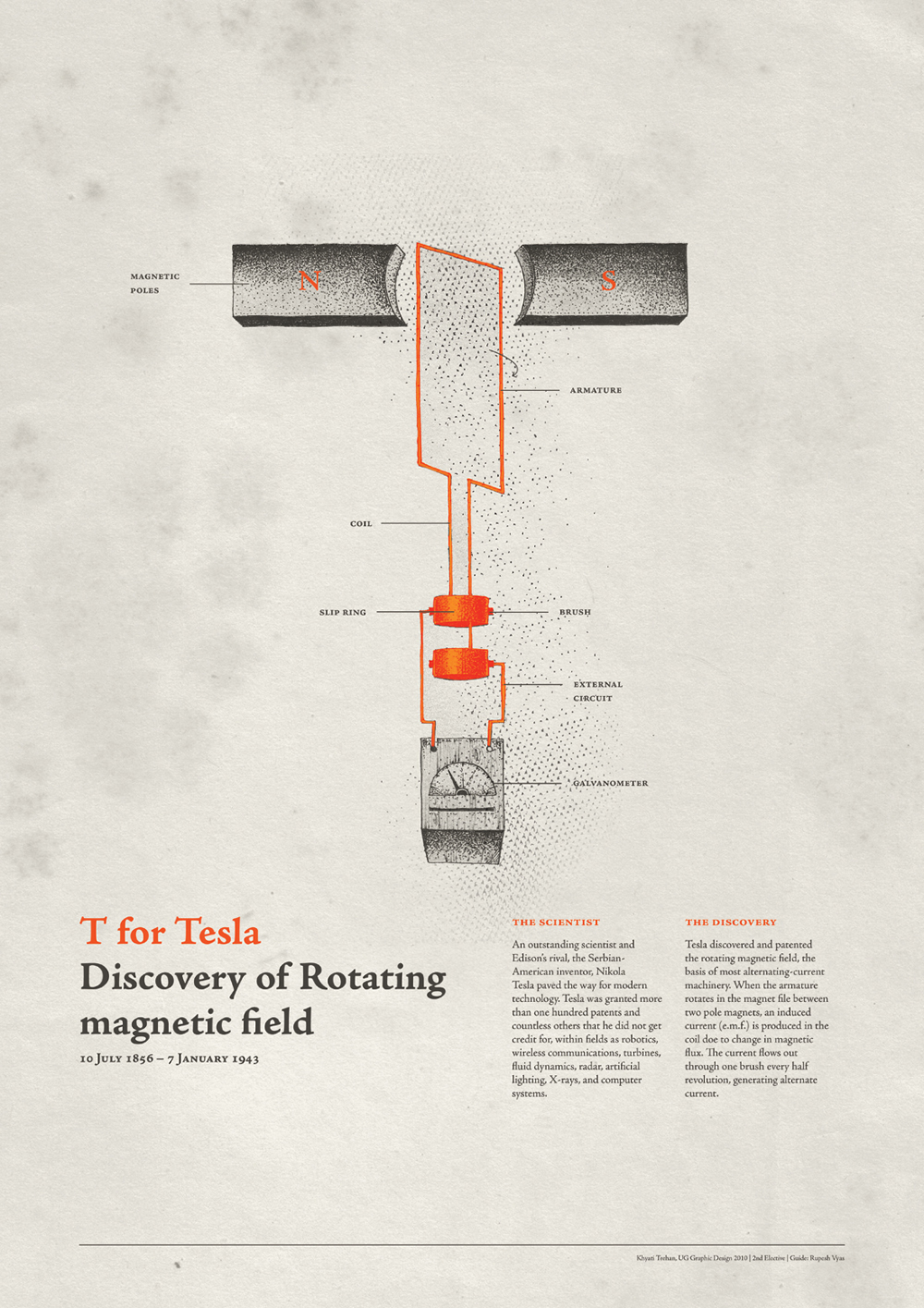

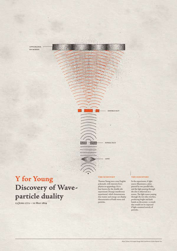
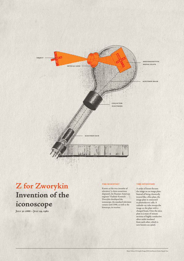
I spent hours poring over patent drawings and scientific textbooks looking for suitable inventions I could turn into visuals that worked in the series. This appetite for accuracy came at a cost – I couldn't find the sweet spot for scientists and their discoveries for the letters P, Q and X, and so decided to practice some restraint rather than distorting them to the point of nonsense.
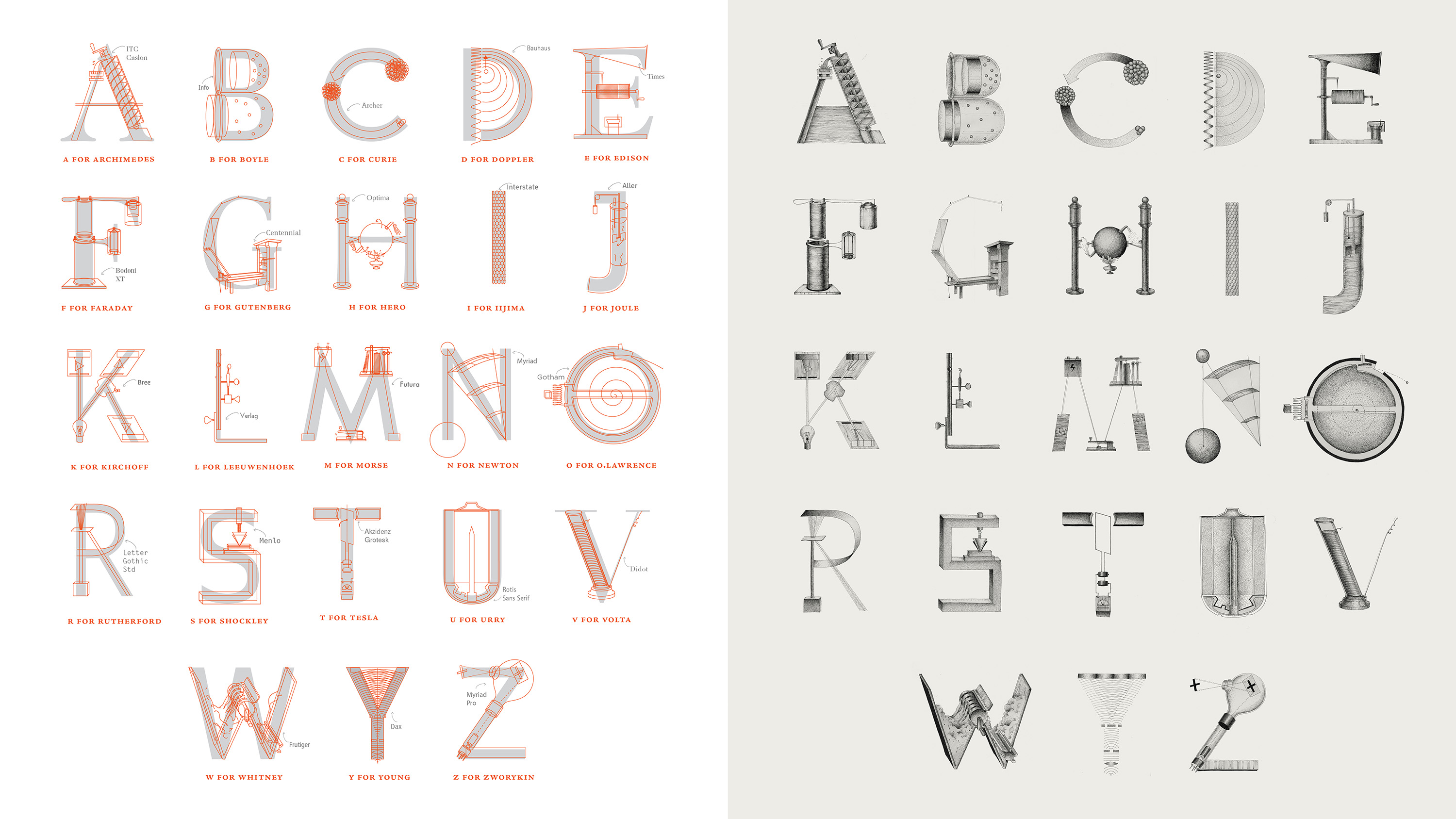
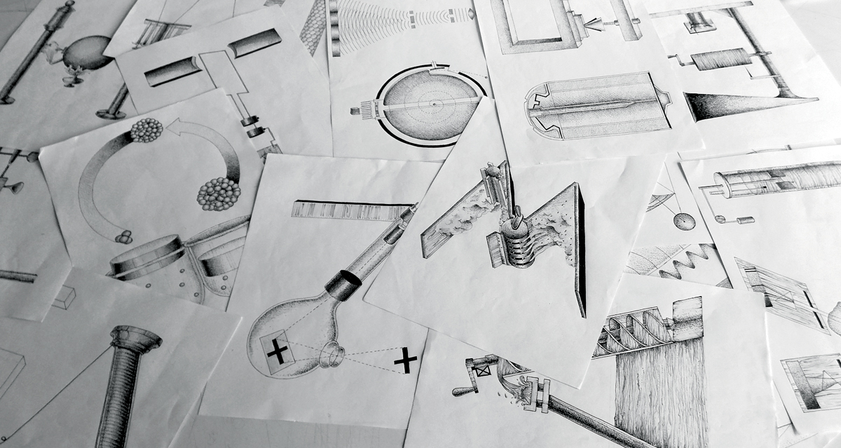
The illustrative style of the letters comes from the research material I was immersed in. Something about the imperfections of the old patent drawings and sketches felt really tactile and the style reflected the limitations of the tools back then. I tried to recreate that arduous process by making life difficult for myself and painfully stippling every letter.